In a remarkably short timeframe, we led the end-to-end design of over 500 high-fidelity screens and 75+ user scenarios for National Gas’s gas transmission data portal. Through iterative collaboration and clear communication, these designs were seamlessly handed off to the development team, ensuring smooth implementation and successful deployment.
UCD Lead
Product, UX & UI Design
Product strategy
1 x product manager
1 x product designer
1 x content designer
0.5 x user researcher
3 x developers
6 months
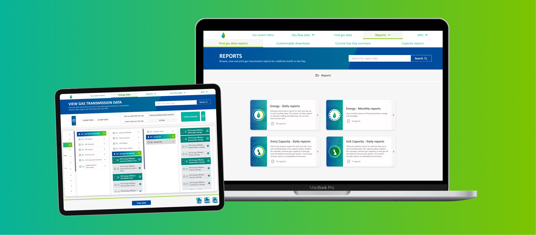
During a period when energy dominated global headlines, natural gas emerged as a critical commodity for Great Britain’s energy sector and its citizens.
At the time, National Gas had recently separated from National Grid and needed to re-establish its digital presence. The existing Market Information Provisioning Initiative (MIPI) platform was outdated, filled with technical jargon, and difficult for users to navigate. As a nationally significant platform providing access to as transmission data, a complete overhaul was essential.
Our team was tasked with designing, developing, and launching a refreshed identity and user experience for National Gas’s data portal. With tight deadlines and high stakes, we adopted a fast-paced, solutions-driven approach—prioritising expert UI design and agile decision-making over traditional user research methods. The result was a modern, intuitive platform that met both user needs and national expectations.
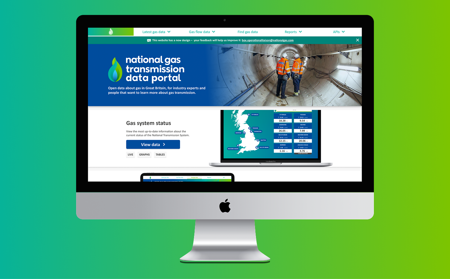
One of the initial challenges was familiarising ourselves with National Gas’s existing data platform, a technically complex service layered with industry-specific terminology. The platform’s dense structure and unintuitive navigation further compounded the learning curve, making it essential to quickly decode both the content and the user journey.
We conducted a comprehensive audit of the entire service. Our findings were synthesised into key thematic areas, allowing us to quickly identify and prioritise the most critical issues. We adopted an agile, iterative approach, tackling one theme at a time, rapidly designing solutions, and handing them off to developers immediately. This “conveyor belt” workflow enabled continuous progress and efficient collaboration.
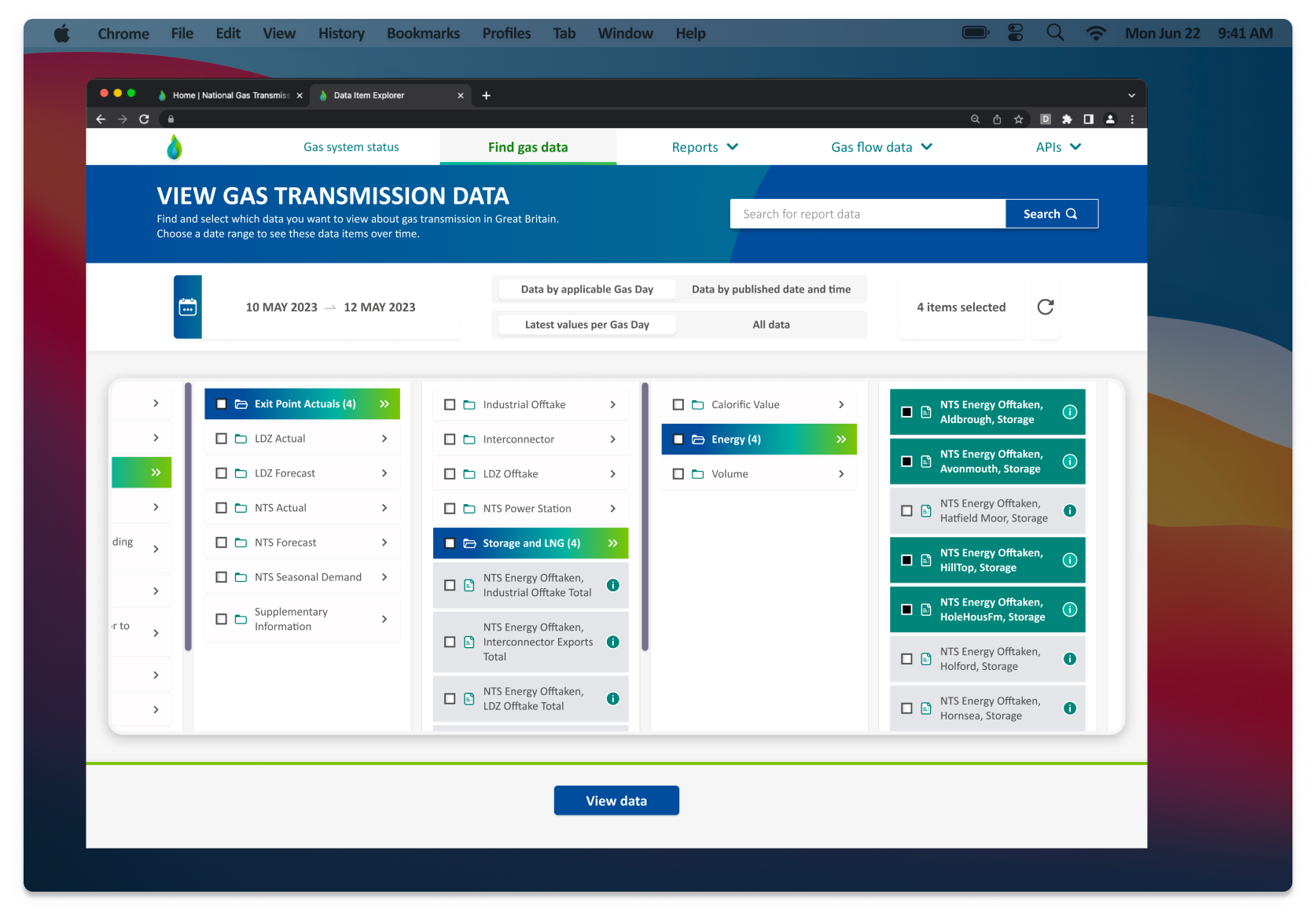
The most critical part of gas transmission data portal was ‘Data Item Explorer’, a central library for live and historic data, and the platform’s highest-traffic area. Redesigning it was a major challenge, especially under tight time constraints and with restrictions that prevented changes to the folder structure. The focus had to be a complete UI overhaul.
To solve this, we looked beyond the energy sector for inspiration. Apple’s column-view pattern, proven over decades, offered a fast, intuitive way to navigate complex hierarchies. It allowed users to move between folders with ease and clarity. Using this as inspiration we adopted a similar approach with National Gas’s new brand identity.
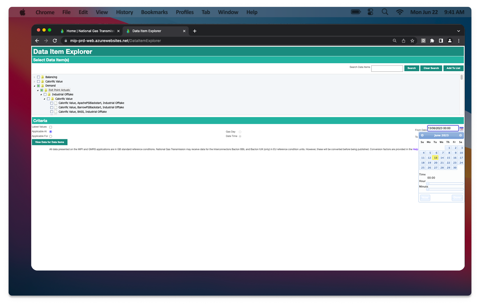
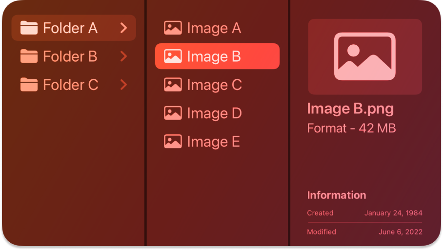
User testing confirmed the impact: the Apple-inspired column-view structure felt instantly familiar and intuitive. Users were able to navigate the platform with greater ease and confidence, significantly improving their ability to locate and download data.
This success set the tone for the rest of the project. Adopting a similarly fast-paced and focused approach, we tackled each remaining challenge with smart, efficient design solutions, balancing speed with precision. Despite the constraints, the final product delivered a vastly improved user experience, aligned with the new brand identity and ready for national-scale use.
I don't usually use [the old service], but I love this! We could put this on a big screen in front of the control room so that people can see it all the time. It is in your face and it looks great.
Control room operator (Energy networks provider)
I did not know that half of these things existed on the original site and I found it in seconds on the new site. I really like it!
Energy Insider (Trader at Energy Company)
I'm sorry I'm getting lost in the data. This is really cool. This could help solve our grid capacity issues. I did not even know this existed.
Policy Influencer (Policy Advisor in Renewable Energy)
I really like this new service. You have made it easy to use. It looks nice, I can see where everything is. It's really clear what I am getting. I'm excited.
Enquiring Mind (Research Fellow)
Everything is under one place. We often get queries from shippers to send them data because they look at prevailing view and want to download it. This is great that we can send them links to the reports and data item explorer and they can find it easy. It's going to reduce the calls that we get about that.
Capacity team (National Gas)