We led a full end-to-end redesign of a high-impact government service that had long struggled with poor usability, low trust, and accessibility issues. Through in-depth user research, accessibility audits, and iterative design, we transformed the experience for both customers and case managers, making it faster, clearer, and more empowering. The new service was praised by users and case managers, and was even acknowledged in Parliament by ministers as a key step in modernising Access to Work.
UCD Lead
Product, UX & UI Design
Product strategy
1 x product manager
1 x product designer
1 x content designer
1 x user researcher
1 x business analyst
12 months
Access to Work is sometimes referred to as Government’s ‘best kept secret’. It is a grant that can fund support to Britain’s 4.4 million people who have health conditions or disabilities that affect them at work.
I’ll use myself as an example. I am dyslexic. If I felt that I was struggling to do my job due to my dyslexia, I could apply for a funding from Access to Work for support such as dyslexia software. Despite being a fantastic service in principle, from a digital application perspective Access to Work was designed poorly and consequently leaving applicants feeling confused and offended.
Our mission was to completely refresh the service from the ground up, significantly enhancing the user experience in parallel and capturing all the complex network of data points required by policy and case managers.
Our initial objective was to conduct a comprehensive discovery phase to understand why the service was underperforming and had developed a poor reputation among users. This involved identifying key pain points across the user journey and uncovering the root causes of dissatisfaction for both customers and case managers.
Using the insights gathered, it would allow us to work through our alpha and beta phases, completely redesign the service delivering a refreshed user interface, updated content, and improved user experience that met the expectations of all user groups. The redesign needed to align with the GOV.UK Design System (GDS) standards and remain within the boundaries of existing technical constraints and policy requirements.
Our Discovery phase revealed a number of critical issues that were contributing to the service’s poor performance and negative user perception. Through user interviews, accessibility and design audits, and analysis of service data, we identified recurring themes that became the foundation for our design workshops and future improvements.
It became clear that the majority of themes uncovered during research could be grouped into two primary areas of concern:
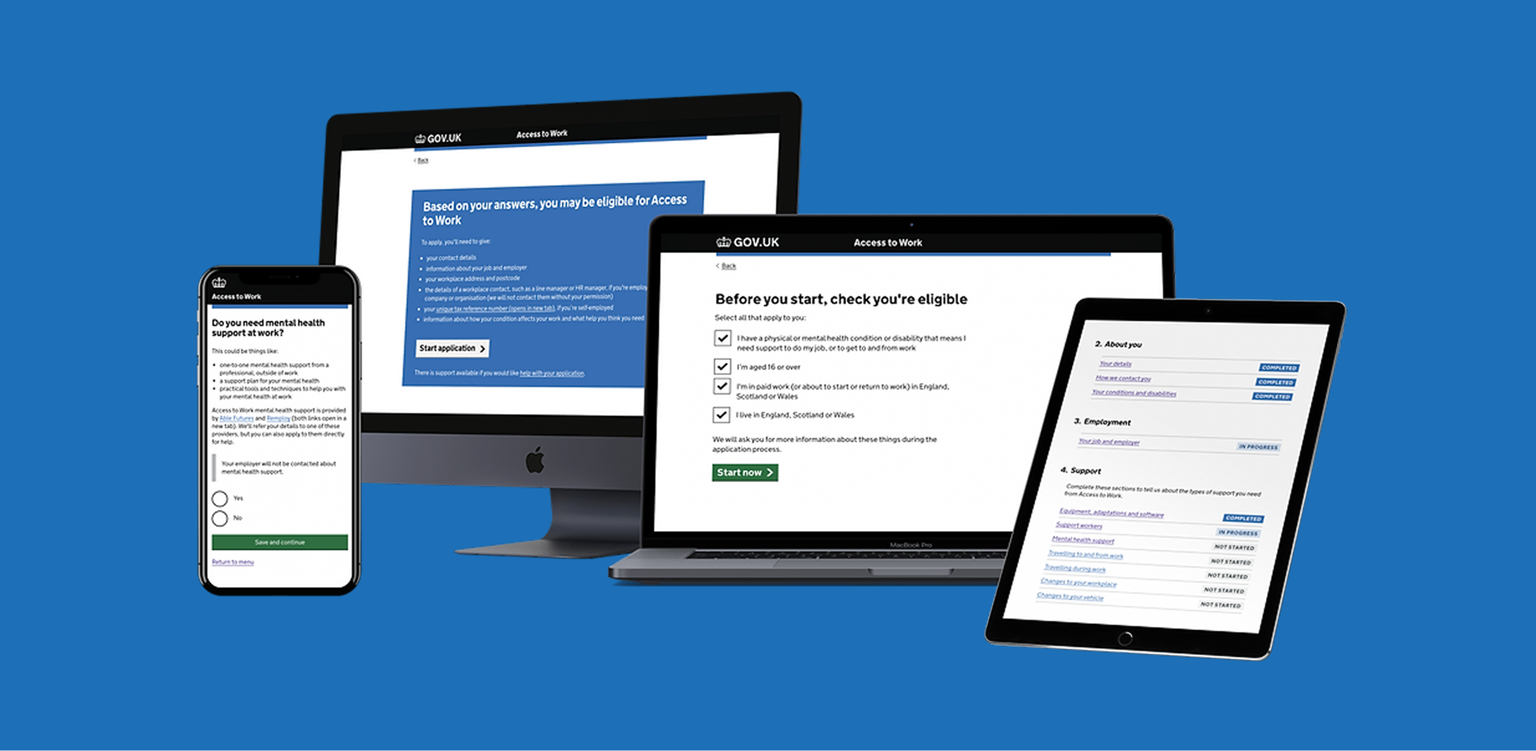
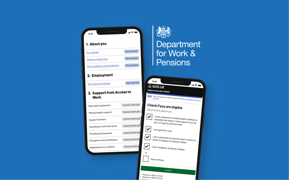
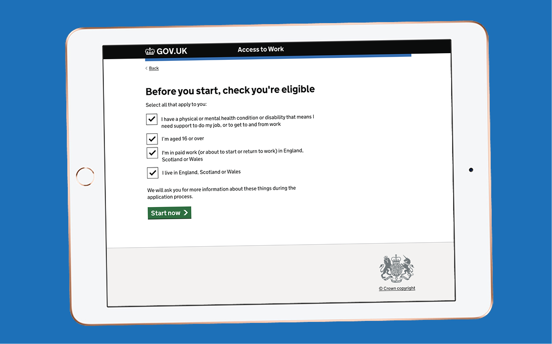
Determining Eligibility was a major friction point in the original service. Users were often asked to provide detailed personal and medical information before being told whether they were even eligible for the grant: leading to frustration and wasted effort.
We explored several hypotheses to solve this, including:
While both approaches tested well in terms of clarity, they introduced new challenges, such as security concerns and increased interaction cost due to the number of screens and clicks required.
After multiple iterations, we landed on a simpler, more scalable solution: clear, upfront content paired with a checkbox component. By placing this screen early in the journey, users could quickly and confidently determine their eligibility without unnecessary effort. This approach also future-proofs the service, if eligibility criteria change, we can easily update the content or add new checkboxes without disrupting the flow.
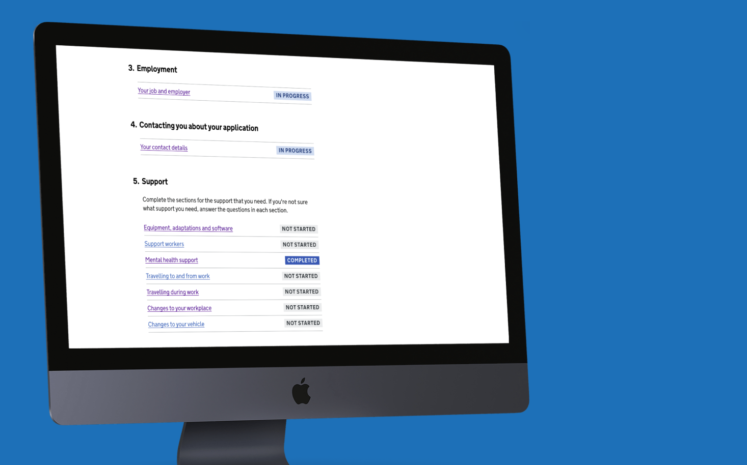
For Lack of structure and clarity the original service was overly linear and rigid, offering little flexibility for users with varying levels of knowledge or support needs. We needed a way to accommodate both users who were unsure of what they needed and those who were ready to provide detailed information.
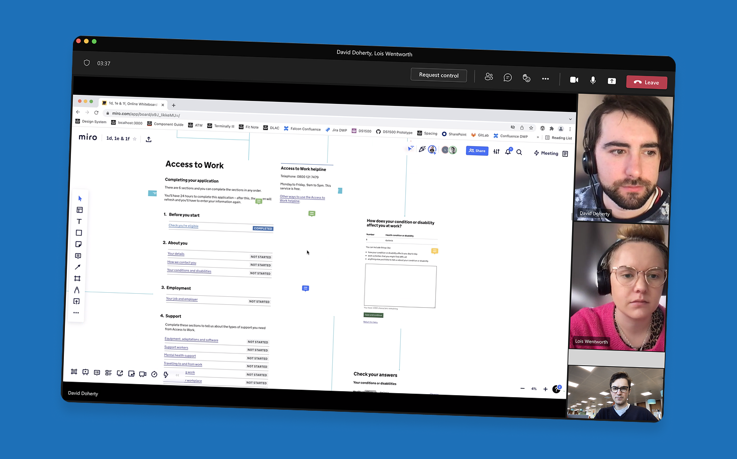
To solve this, we introduced the Task List pattern, a flexible, modular approach that adapts to different user journeys. Whether a user knows exactly what support they need or is just starting to explore their options, the task list provides a clear, manageable structure.
The beauty of this pattern is its adaptability. Users can complete as much or as little as they need, focusing only on the sections relevant to them. It also gave us a scalable framework to test and iterate on each section independently.
If you're ever designing a complex service with lots of variables, I highly recommend this approach. It helped us break the journey into bite-sized, testable chunks. For example, we ran a focused sprint just on the “Your job and employer” section—allowing us to refine the content and interaction model in isolation before integrating it into the wider flow.
The redesigned service was a breakthrough, transforming a previously frustrating and inaccessible experience into one that users, case managers, and even government ministers praised.
According to the latest Access to Work statistics:
These figures reflect not only improved usability but also a broader impact in terms of accessibility, reach, and trust in the service.
This is brilliant. I love the fact that you're catering to all kinds of disabilities
It's opened my eyes up to further support that could be useful to me
Clearly there has been a lot of work done on this, and it looks really straightforward